Andy Eschbacher, @MrEPhysics, eschbacher@cartodb.com
Workshop here: http://bit.ly/cdb-berkeley-mapdesign
- Before we dive into CartoDB, let's talk a little bit about web maps
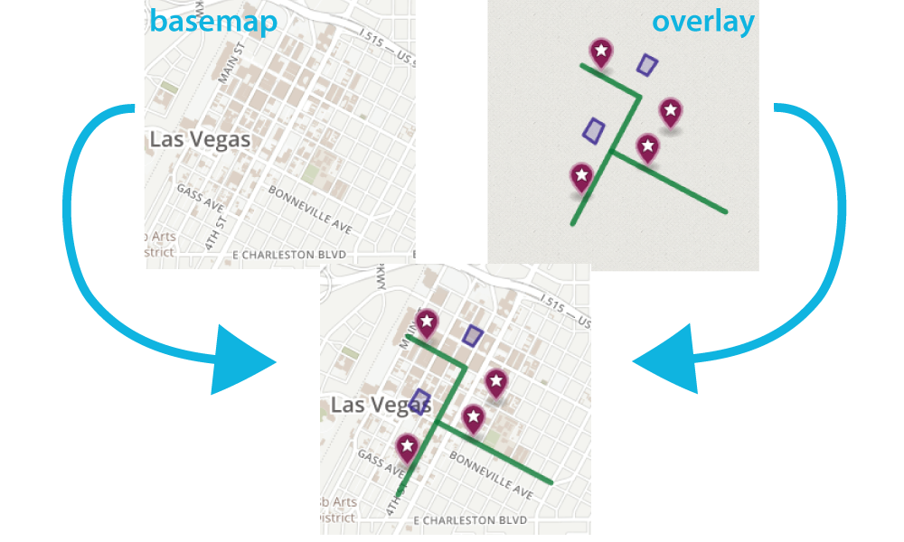
- When we talk about web maps, we are referring to a few different components:
- the map (aka, basemap)
- the data overlay
- and the interface that the map sits in
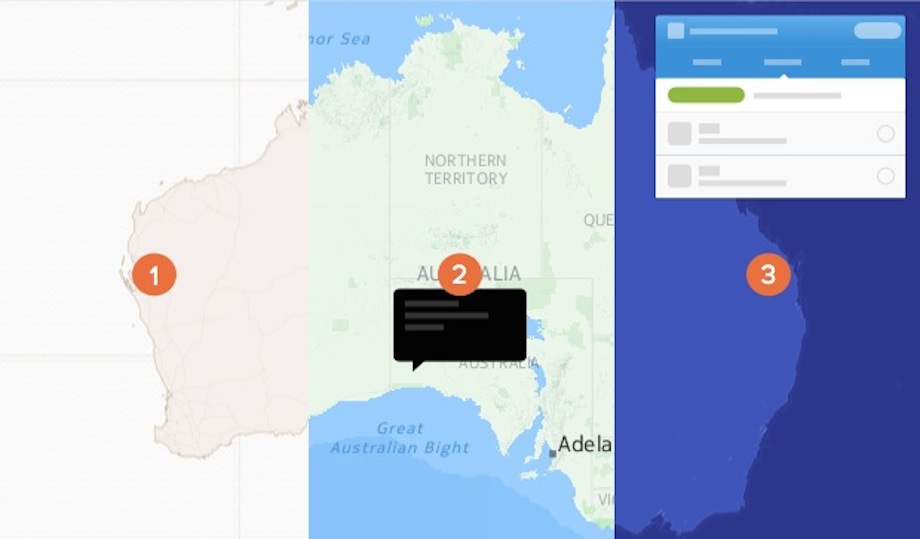
- In some ways yes, because the maps are on the web, but when we are talking about web maps, we're usually talking about a map like this
A map that provides geographic context to help support a wide variety of overlays- typically raster tiles.
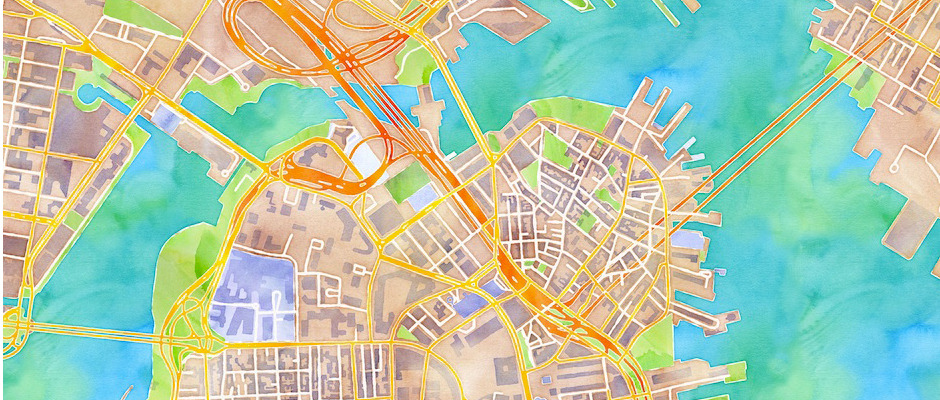
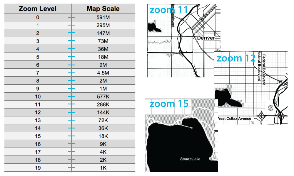
The dimensions are 256x256 pixels and organized based on coordinates (x,y) and zoom levels (z).

Defines the scale of the current map view. Ranges from 0 (entire world) to 21 (individual building level).

Themes of information overlaid on a basemap that help tell a story - typically vector.
Javascript/HTML/CSS for rendering on the web
With these languages you can publish your map with the basetiles loaded and your data layers appropriately geocoded; with JavaScript you can also add to the interactivity of your map, revealing metadata in the tooltips

- easily overlay data onto a map
- analyze the data to reveal spatial patterns
- tell stories by creating beautiful visualizations
- and then share them with the world!
- the power of PostGIS and SQL
- CartoCSS for map styling
- JavaScript for overlay and interactivity
- Mapnik for tile rendering
These technologies are all packaged into one easy-to-use online interface.
- Alcatraz Escape Revisited
- LA Sheriff Election Results
- Starwars Galaxy Map
- Demonstrations in Brazil
- Global Forest Watch
- Urban Reviewer
- Photogrammar
Source: The Data Visualization Catalogue.
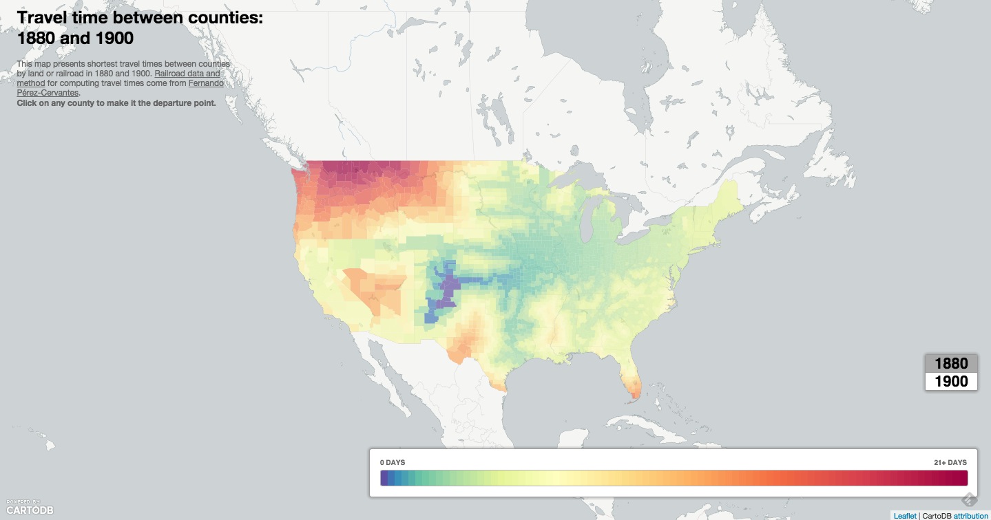
Source: Time Travel Between Counties, CartoDB.js
DATA SEARCH TOOLS
Source: GDELT Geographic News Search Tool
Journalists have used the GDELT data to track wildlife crime, and the spread of the Islamic State in the Middle East among other things.
You can fork the GDELT hourly synced data set from the CartoDB Data Library and add it as a layer on your map or use the Geographic Search Tool linked above to search for tags of interest.
CHART GRAPHICS
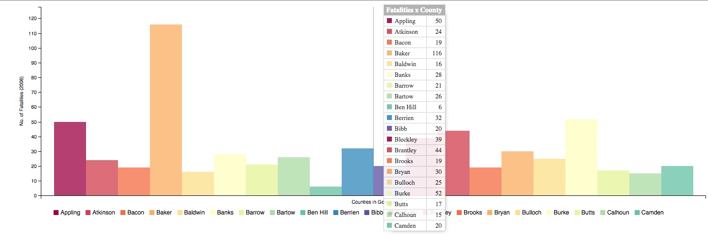
Source: Geogia County Car Crash Counts, C3.js
- What is the purpose of the map?
- Where can I get the data?
- Will the map be queried for additional information?
- Will the map be viewed on multiple devices?
Geospatial data is info that ids a geolocation and its characteristic features/frontiers, typically represented by points, lines, polygons, and/or complex geographic features.
Issues:
- Comes in multiple formats (supported formats for CartoDB)
- Sources uncertain
- Contains errors
- etc.
Geocoding + SQL/PostGIS The most basic SQL statement is:
SELECT * FROM table_nameSELECTis what you're requesting (required)FROMis where the data is located (optional)WHEREis the filter on the data you're requesting (optional)GROUP BYandORDER BYare optional additions, you can read more about aggregate/other functions below.
There are three special columns in CartoDB:
the_geomthe_geom_webmercatorcartodb_id
The first of these is in the units of standard latitude/longitude, while the second is a projection based on the original Mercator projection but optimized for the web. cartodb_id is a unique number identifying row numbers and is very fast for executing queries.
If you want to run SQL commands and see your map update, make sure to SELECT the the_geom_webmercator because this is the column that's used for mapping--the other is more of a convenience column since most datasets use lat/long. If you want to keep interactivity (infowindows, etc.), you need to include cartodb_id in the query results.
Sync Tables
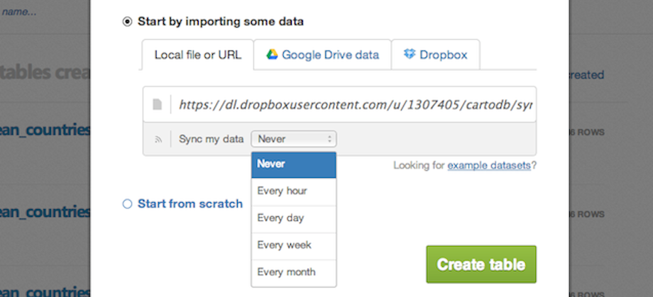
The Editor is setup to process realtime data updates via sync tables.
You can import data that lives online via a URL, and set it to pull and update your map at regular intervals.
Check the file types supported in sync tables; keep in mind that it also works with Dropbox + Google Drive.
Notes:
- to auto-geocode a sync table, verify that it contains the following:
- country column, a latitude column and a separate longitude column
- a column of IP addresses
- postal codes
- to edit sync tables you need to be disconnected from the data source, so during syncing, you can use SQL to manipulate the dataset on the fly
- you can create sync tables in both the Editor and via the Import API
You have myriad customization options in the in-browser editor:
sql- run sql and postgis functions across your datawizard- adjust the type, colors and fills in your mapinfowindow- create hovers, tooltips with information from your datatablescss- customize the css and style of your map outside the wizardlegends- create keys for your mapfilters- filter the data without sql
Likewise, many types of visualizations:
- Simple -- most basic visualization
- Cluster -- counts number of points within a certain binned region
- Choropleth -- makes a histogram of your data and gives bins different colors depending on the color ramp chosen
- Category -- color data based on unique category (works best for a handful of unique types)
- Bubble -- size markers based on column values
- Intensity -- colors by density
- Density -- data aggregated by number of points within a hexagon
- Torque -- temporal visualization of data
- Heat -- more fluid map of concentration; emphasis on far over near-view
- Marker Fill: change the size, color, and opacity of all markers
- Marker Stroke: change the width, color, and opacity of every marker's border
- Composite Operation: change the color of markers when they overlap
- Label Text: Text appearing by a marker (can be from columns)
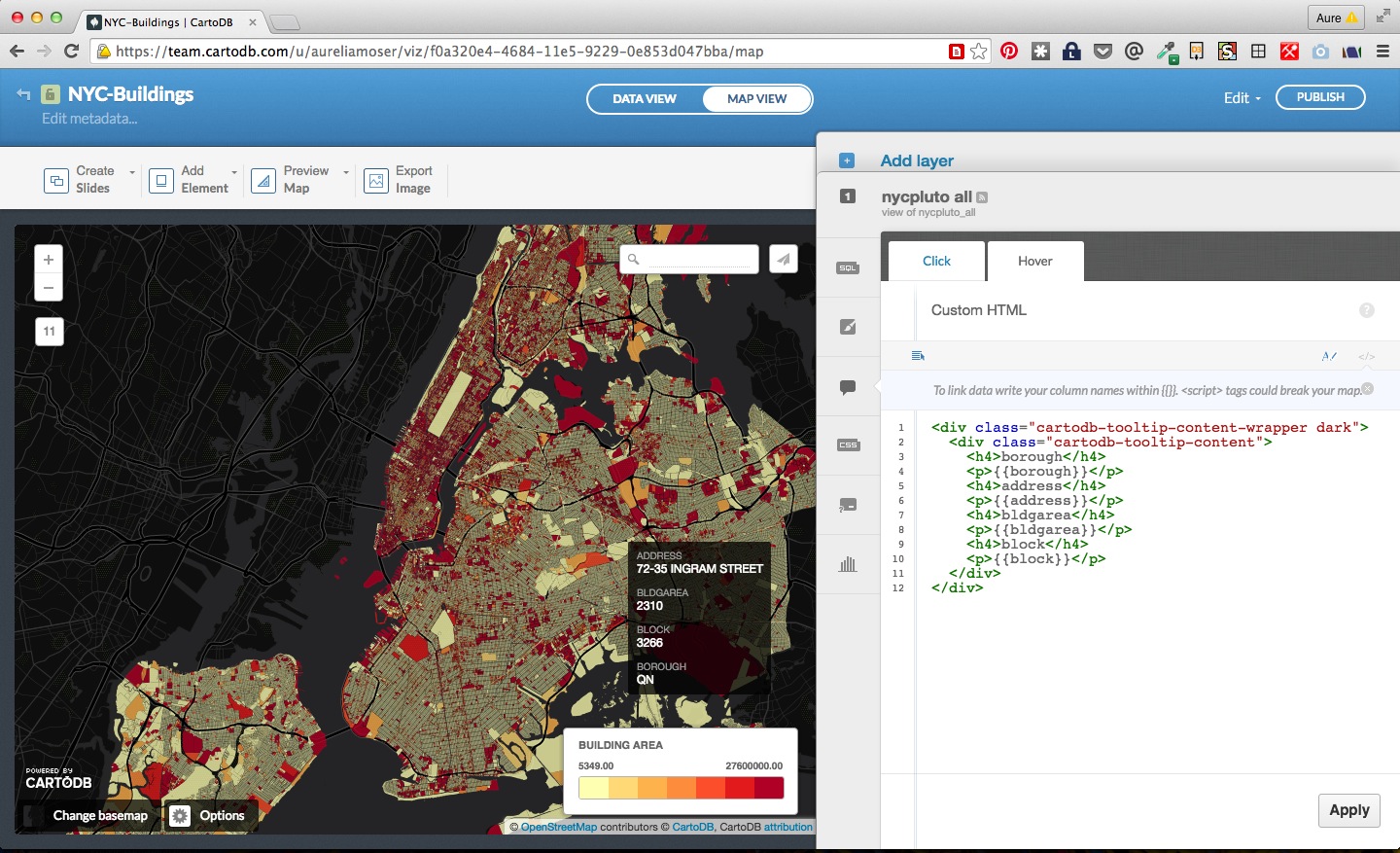
- Select which column data appear in infowindow by toggling column on
- Customize further by selecting HTML-view
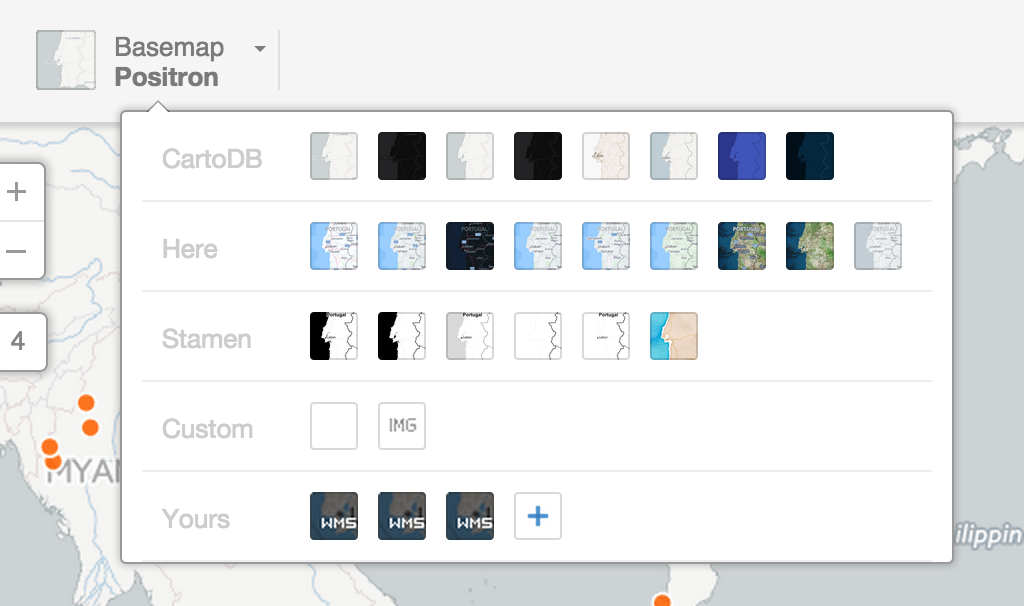
Check out the base CartoDB Basemaps from Stamen.

- Search for the following datasets in the CartoDB Data Library and add them to your account:
- ne_50m_land
- ne_50m_ocean
- Add graticule lines from Natural Earth to CartoDB
- New Dataset
- Copy/paste the URL below and hit Submit
http://www.naturalearthdata.com/http//www.naturalearthdata.com/download/50m/physical/ne_50m_graticules_15.zip
- Go to: https://earthdata.nasa.gov/earth-observation-data/near-real-time/firms/active-fire-data
- Scroll down to the link for world readings in shapefile format
- Right-click, and copy link address
https://firms.modaps.eosdis.nasa.gov/active_fire/shapes/zips/Global_24h.zip- choose the option to sync every hour
- New Map
- Find the three layers from above, highlight, and click Create Map
- Order Layers
- Put the layers in the following order from top to bottom:
global_24hrne_50m_landne_50m_graticule_15ne_50m_ocean
- Put the layers in the following order from top to bottom:
- Our final map uses the Robinson Projection. One of the really powerful capabilites of CartoDB is the ability to project layers on the fly and publish that to your web map. To use the Robinson Projection, we need to add it to your list of availble projections (there is a table in your account called Spatial Ref Sys).
- To add the Robinson Projection, copy and paste the information here into the SQL tray:
INSERT into spatial_ref_sys (srid, auth_name, auth_srid, proj4text, srtext) values ( 54030, 'ESRI', 54030, '+proj=robin +lon_0=0 +x_0=0 +y_0=0 +datum=WGS84 +units=m +no_defs ', 'PROJCS["World_Robinson",GEOGCS["GCS_WGS_1984",DATUM["WGS_1984",SPHEROID["WGS_1984",6378137,298.257223563]],PRIMEM["Greenwich",0],UNIT["Degree",0.017453292519943295]],PROJECTION["Robinson"],PARAMETER["False_Easting",0],PARAMETER["False_Northing",0],PARAMETER["Central_Meridian",0],UNIT["Meter",1],AUTHORITY["EPSG","54030"]]');- Use
ST_Transformto project each layer- We'll project each layer in the World Robinson projection
- To do this we'll use
ST_Transformalong with theSRIDfor the projection - Expand the view for
ne_50m_land, click on SQL for the SQL tray and add the following:
SELECT ST_Transform(the_geom, 54030) AS the_geom_webmercator FROM ne_50m_land- Do the same for
ne_50m_oceanandne_50m_graticule_15
- For the
global_24hractive fire readings from MODIS, we'll project, and query the data for attributes that we'll use to symbolize the overlay. - On our final map
- we only want to display fires that have a confidence value of greater than or equal to 50
- we'll symbolize the points based on their brightness
- have the brightest points drawing on top
- and enable interactivity on the fire point
To do this, add the following to the SQL tray for
global_24hr:
SELECT
  ST_Transform(the_geom, 54030)
AS
  the_geom_webmercator,
  cartodb_id,
  confidence,
  brightness
FROM
  global_24h
WHERE
  confidence>=50
ORDER BY
  brightness ASC
- Since we are styling our own simple basemap, let's remove the default basemap from Positron to a solid background
- Click on Change Basemap in the bottom left hand corner
- Click on the color chip, and choose white
- We want our theme (active fire readings) to be highest in the visual hierarchy in our final map. In order to achieve this, we will style our land, graticule, and ocean layers using minimal colors:
ne_50m_ocean:
#ne_50m_ocean {
  polygon-fill: #9fc4dd;
  polygon-opacity: 0.7;
}
ne_50m_graticules_15:
#ne_50m_graticules_15{
  line-color: #FFFFFF;
  line-width: 0.5;
  line-opacity: 0.7;
}
ne_50m_land:
#ne_50m_land{
  polygon-fill: #ede1d8;
  polygon-opacity: 1;
}
- Now let's take a look at what options are available to symbolize the fire data:
- Click on the Wizard
- Look through the different options
- symbolize based on choropleth points
- choose 5 buckets and classification scheme
- Try out some compositing operations
- If you like, you can also change the colors of the fire points on your map
- An easy way to test out colors is using CartoCSS variables
- Click on the
CSStab and try assigning each class a color based on a variable:
@1:#FFF700;
@2:#FF7C3B;
@3:#E03E36;
@4:#B80D57;
@5:#700961;
Here is the styling I used:
/** choropleth visualization */

  @1:#FFF700;
  @2:#FF7C3B;
  @3:#E03E36;
  @4:#B80D57;
  @5:#700961;

#global_24h{
  marker-file: url(http://com.cartodb.users-assets.production.s3.amazonaws.com/maki-icons/square-18.svg);
  marker-fill-opacity: 0.8;
  marker-line-color: #FFF;
  marker-line-width: 1;
  marker-line-opacity: 1;
  marker-width: 10;
  marker-fill: @1;
  marker-allow-overlap: true;
}
#global_24h [ brightness <= 502.71] {
   marker-fill: @5;
}
#global_24h [ brightness <= 402.2] {
   marker-fill: @4;
}
#global_24h [ brightness <= 375.7] {
   marker-fill: @3;
}
#global_24h [ brightness <= 352.7] {
   marker-fill: @2;
}
#global_24h [ brightness <= 329.8] {
   marker-fill: @1;
}
- Click on the infowindow option on the
global_24hrlayer - Choose the style and information you want to show in your popup
- for Brightness add unit of measurement (Kelvin)
- for more information see: https://earthdata.nasa.gov/files/README_SHP.pdf
- Click the option to
Add Element - And choose
Add title item - Change the placement, font, color, etc.
- Click on options and choose which map elements you want from the list
- You can use this simple basemap again for different themes of information and style it accordingly